All three of these images are CD covers of
some of my favorite bands. In all of these are examples of feature hierarchy
and visual queries.
 |
http://www.freecodesource.com/album-covers/B004IDV2KC--hoobastank-is-this-the-day-album-cover.html |
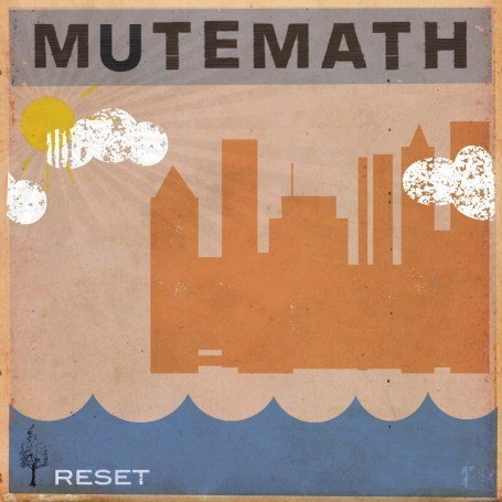 |
| http://www.lyricspond.com/artist-mute-math/album-reset |
For the Mutemath album cover I found myself
looking at the top title then towards the middle down to the bottom and back up
again. I realized that in this design there were three points that caused this
eye movement. From the top left corner my eyes follow from left to right where you
can see the band name Mutemath in its full extended and elongated form filling
the top portion of the cover, from there my eyes continue to the right middle
towards the silhouette of a city which is created with various shapes and defined
by a darker orange color to contrast the background. Finally my eyes go back to
the left into the bottom corner where again color and patterns establish
contrast, here we see the name of the album “Rest”. Solving the reason for my
eye movement I was able to find the pattern (pattern finding) and realized the
entire album forms the shape of a triangle.
 |
| http://www.cdstarts.de/kritiken/88139-Incubus-Light-Grenades.html |
In this Incubus “Light Grenades “album cover color is an obvious
contribute to feature hierarchy. By using the color red, the eyes create a bias
and makes all that one color stand out. This bias directs the eye to find more
red. By outlining the band name and filling the title of the album in red we
can quickly identify them. Were as, though the largest portion of the design,
the grenade in the center does not stand out as much because it is black and
white and is overlooked by the red heart in the center of it.
No comments:
Post a Comment